The language of drawing from 50 million QuickDraw.
These sketches come from QuickDraw, a game where we are invited to represent an object, action, animal in 30 seconds. In order to win, I have to find in a few seconds how to represent a stop signal, rain, apple, mouth.
In just a few months the game has become very popular, and now this is the largest collection of sketches ever created, with over 50 million. A gigantic number that represents the power of a collective expression of society. These drawings are a form of direct thinking, they offer a form of embodied abstraction of reality for all the humanity.
Can these drawings collection make us understand something new about humanity? By using these data, can we study the differences in how we see and remember things in relation to our local culture?
We have found drawings from 215 different nations. There are a few places in the world where this game has not arrived, such as Antarctica, Cuba, Cook Islands, Sahara, Sierra Leone ... But 45% of these drawings come from the US, followed by the UK (7%), Canada (4%), Germany (3%), Australia, Russia, Brazil, Sweden, Finland, Czech Republic and Italy are at 2%, followed by many other countries at 1% such as Korea, Thailand, Saudi Arabia, Vietnam, Japan, Emirates, Taiwan, and many more.
To make our analysis more meaningful we decided to observe only nations with at least 200,000 drawings and a minimum of 1000 drawings for each category. This means limiting our observations to a group of 34 nations.
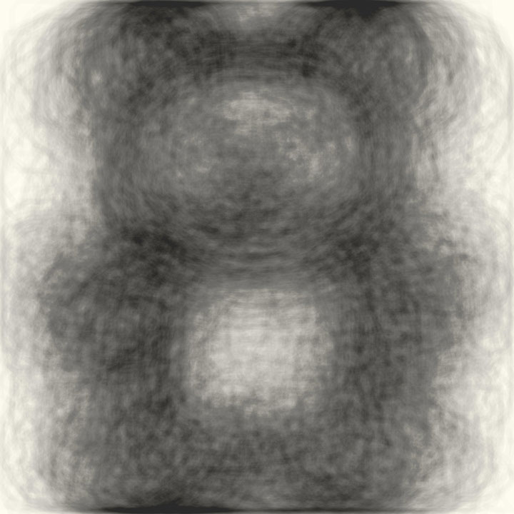
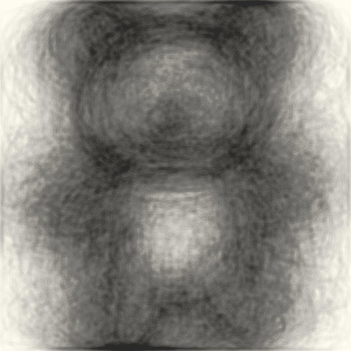
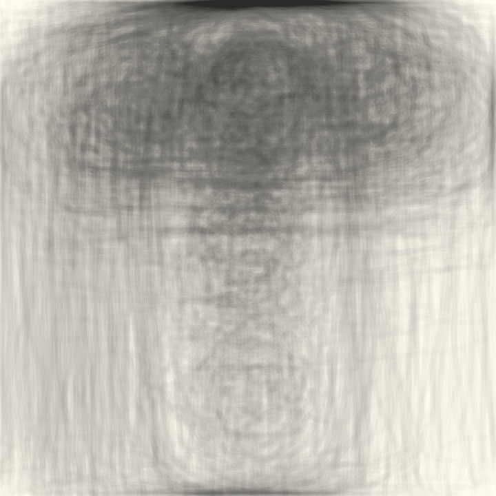
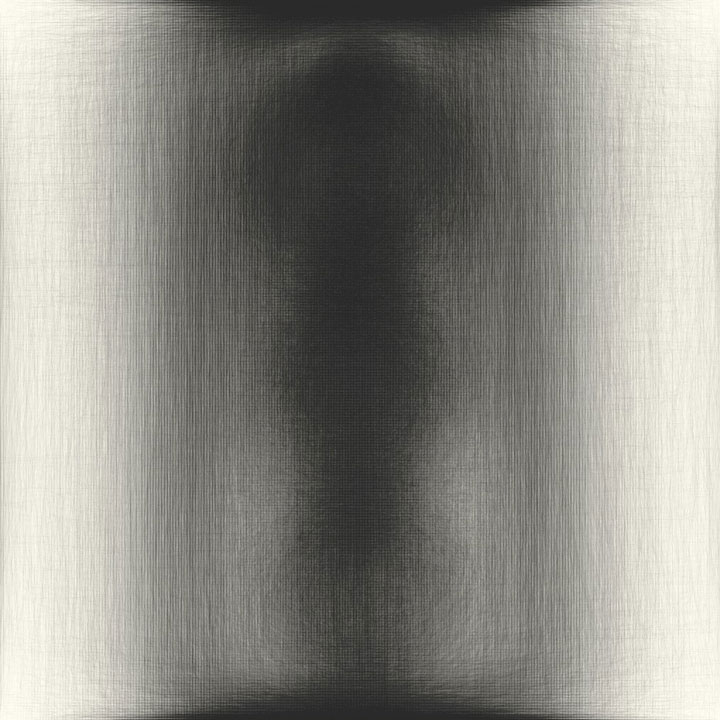
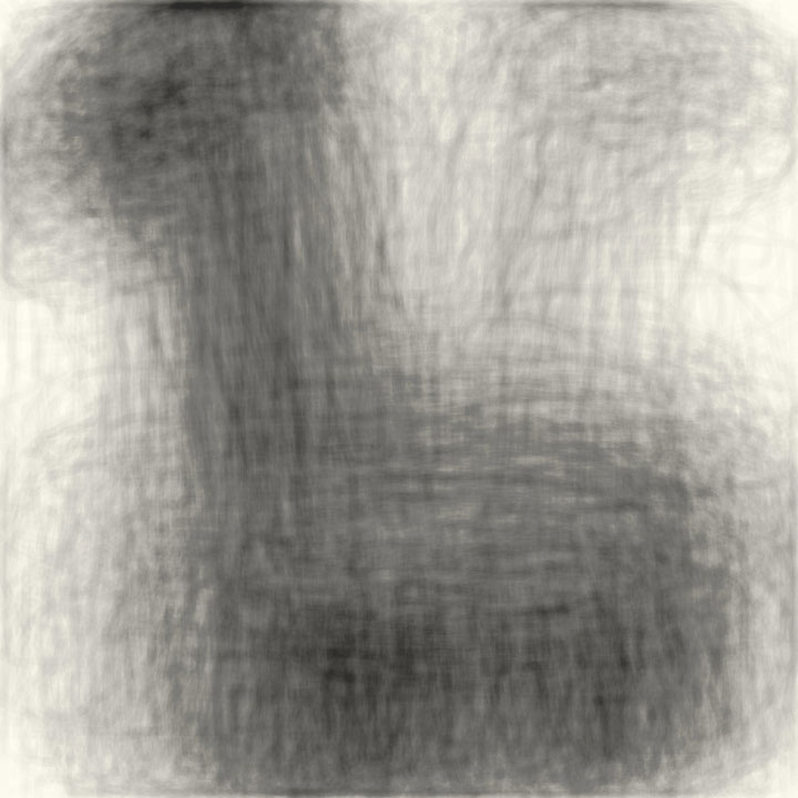
This is a game with a predominantly anglophone audience. As a small test, if players from around the world are not US citizens on vacation we had a look at the
power outlet sketches.
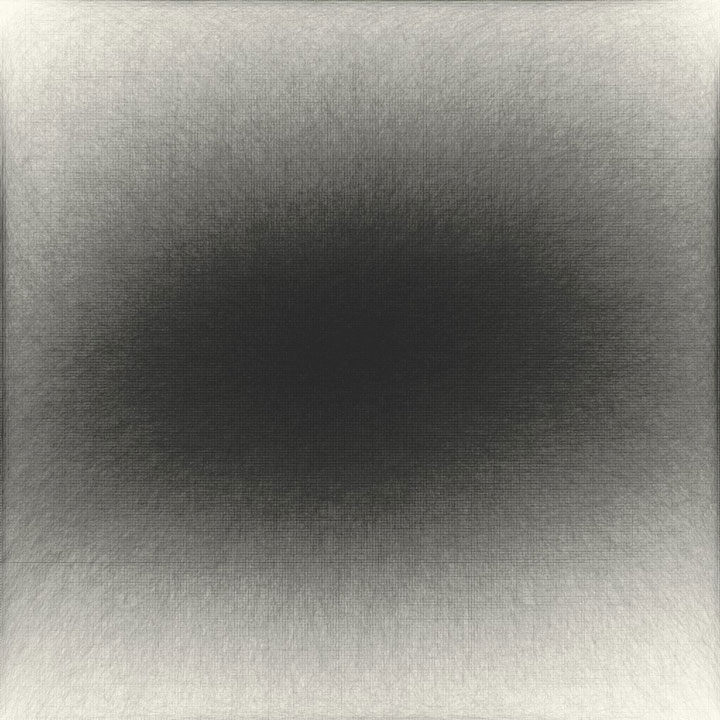
Germany

Power outlet from Germany.
Japan

Power outlet from Japan.
Malaysia

Power outlet from Malaysia.
Sweden

Power outlet from Sweden.
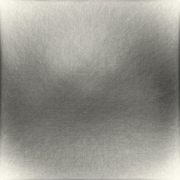
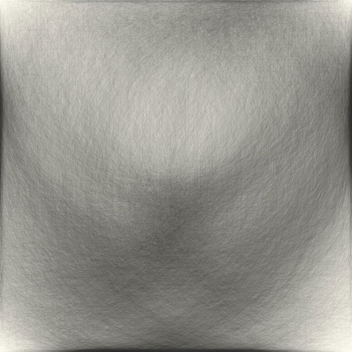
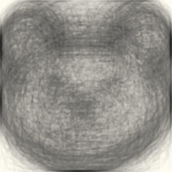
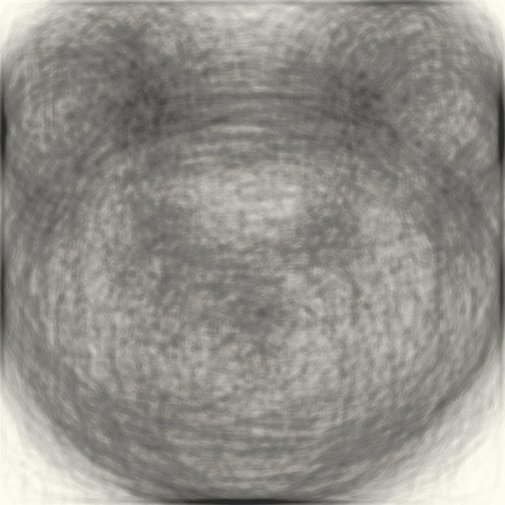
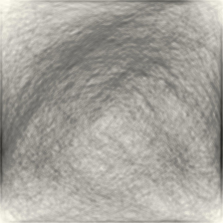
By applying the overlap, we can define the typical form of a power outlet in each nation. The results seem to confirm that most players draw the corresponding power outlet of the nation they connected from. Because the game requires an object to be drawn in 20 seconds, we can assume that the design is instinctive and representative of the power outlet idea of its own nation.
After this experiment we can therefore assume that we can use these data as representative of 34 different countries: Australia, Brazil, Canada, Croatia, Czech Republic, Finland, France, Germany, Hungary, India, Indonesia, Ireland, Italy, Japan, Korea, Malaysia, Netherlands, Norway, Philippines, Poland, Romania, Russian Federation, Saudi Arabia, Serbia, Slovakia, Sweden, Taiwan, Thailand, Turkey, Ukraine, United Arab Emirates, United States, United Kingdom, Viet Nam.
Convergence | Divergence
Step 1. We identify categories with strong convergence and strong divergence.
Examples of strong convergence: wine bottle, asparagus, bowtie, envelope, circle, and many more.
Convergence

Wine Bottle
Convergence

Asparagus
Convergence

Bowtie
Convergence

Envelope
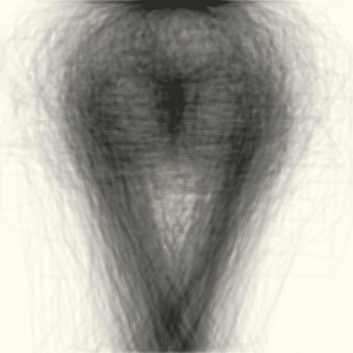
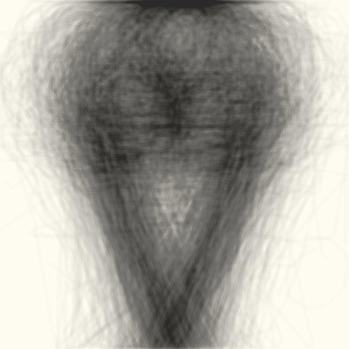
For some categories we also observe a strong convergence in the sequence of drawing sketches. We tend to draw outer shapes
first to define a frame and then add details. See how many people start drawing the head shape (circle) for a smiley first, and then adding eyes and mouth. Similar is true for cars, etc. With our video Points in Movement you can observe this behavior more in detail.
Many categories are ambiguous. Their iconography is diverging. Examples are: Arm, Backpack, Banana, Bed, Dragon, Frog, Lightning, Mosquito and many more. With our IconoLap tool you might still be able to find clusters of convergence.
Divergence
Arm
Divergence

Backpack
Divergence

Bee
Divergence
Mosquito
Step 2. We excluded from the analysis of regional cultural dynamics all categories with strong convergence, objects designed in the same way all over the world, or at least in our 34 nations. We applied the same overlap technique to each category divided by country, so we could find converging images in categories that are globally divergent.
1000 drawings are not a representative sample for an entire nation, especially since there is no information on the population sample that made these drawings.
However, we can observe together if there are some interesting stories that emerge from these data.
Stories
We have not observed any particular predilection that emerges regarding how to draw a banana around the world. Except in Japan, Taiwan, Thailand, United Arab Emirates, India, Korea, Malaysia, Indonesia, Korea, where most people draw it in this way:
Banana in the world
Banana in Japan

A bear is drawn in a very similar way in Japan and Taiwan:
Bear in Japan
Bear in Taiwan
Australians draw boomerangs with the tip upwards:
Boomerang in Australia

Boomerang in the world
Brazil has a prevailing way of thinking about flip flops:
Flip flops in Brazil

Flip flops in the world

Ice cream around the world is a cone with a ball on top of it, except in Italy, Sweden and Hungary, where scoops are side by side:
Ice cream in the world

Ice cream in Italy

Ice cream in Hungary
Ice cream in Sweden
Teddy-bears undergo a manga restyling in Japan and Korea, their heads become bigger than the rest of their body:
Teddy-bear in Japan
Teddy-bear in Republic of Korea
Another cultural link between Japan and Taiwan, they are the only countries where traffic lights are mostly drawn horizontally:
Traffic light in Japan
Traffic light in Taiwan

Traffic in the World
All over the globe the phone is represented as a touchscreen, except in India and Japan, where the historical, almost iconographic form is preferred:
Telephone in the World

Telephone in India

Telephone in Japan
We have discovered that the world is divided into those who draw the whole watermelon and those who draw it in slices, cold countries like Germany and Ukraine prefer the whole version, in warmer countries like Australia slices win:
Watermelon in Germany

Watermelon in Ukraine

Watermelon in Australia

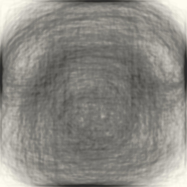
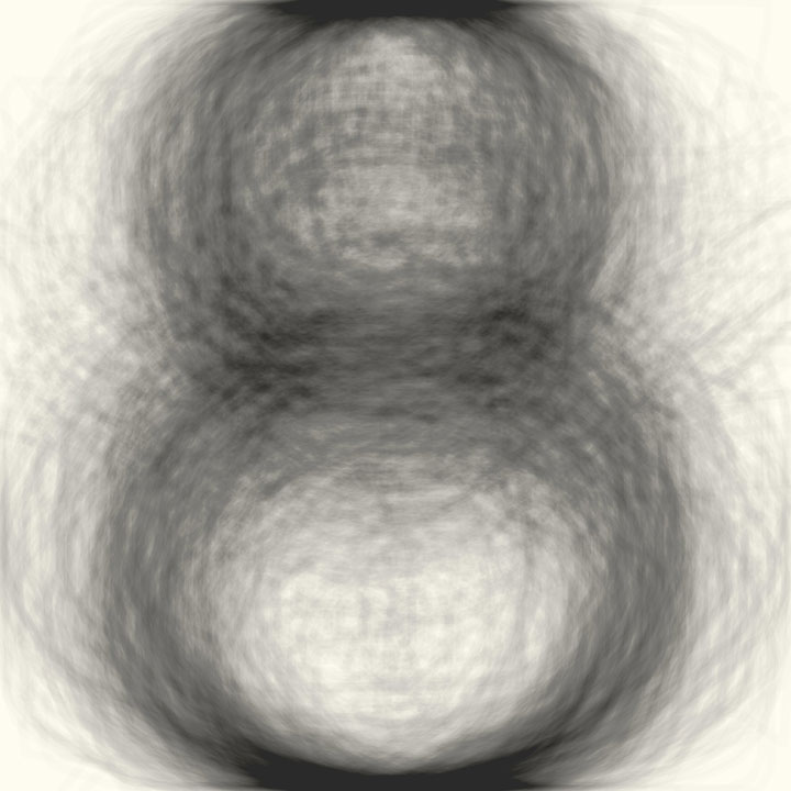
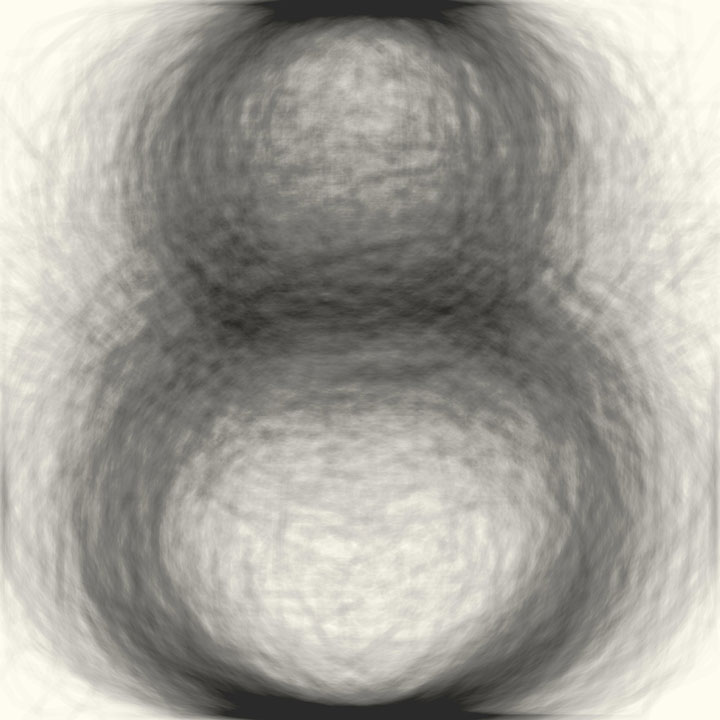
Another anomaly from hotter countries such as India, Japan, Korea, Taiwan and Thailand, is that the snowman consists of two snowballs, while the rest of the world prefers the version with three snowballs:
Snowman in Japan
Snowman in Taiwan
Snowman in the World

The fish swims to the left in India, Japan, Korea, Taiwan, Thailand, while in the rest of the world there is no agreement:
Fish in India

Fish in Japan
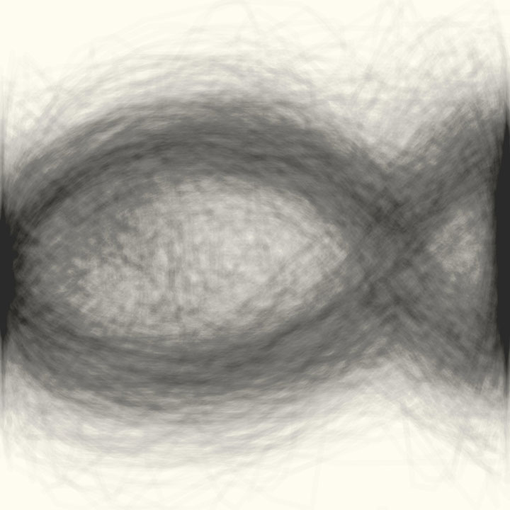
Fish in the world

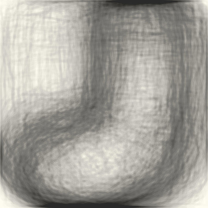
There is a lot of affinity between Korea and Japan, in both countries, for example, socks are drawn to the left:
Sock in Japan
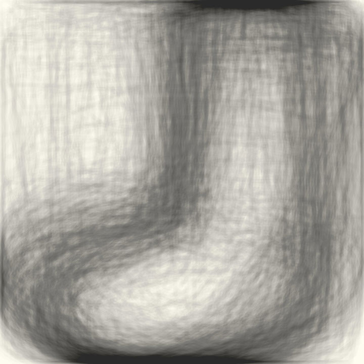
Sock in Republic of Korea
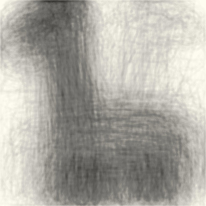
Swan in Japan
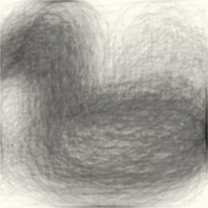
Swan in Republic of Korea

And giraffes go to the left:
Giraffes in Japan
Giraffes in Republic of Korea
By browsing our DoodleMaps, and IconoLap you can discover these and many other stories!
Have fun!


